Most Power BI teams don’t run automated tests against their measures. Not because they don’t want to, but because nobody has written down what the patterns actually are. Unit testing for application code has thirty years of literature behind it; unit testing for DAX has almost none.
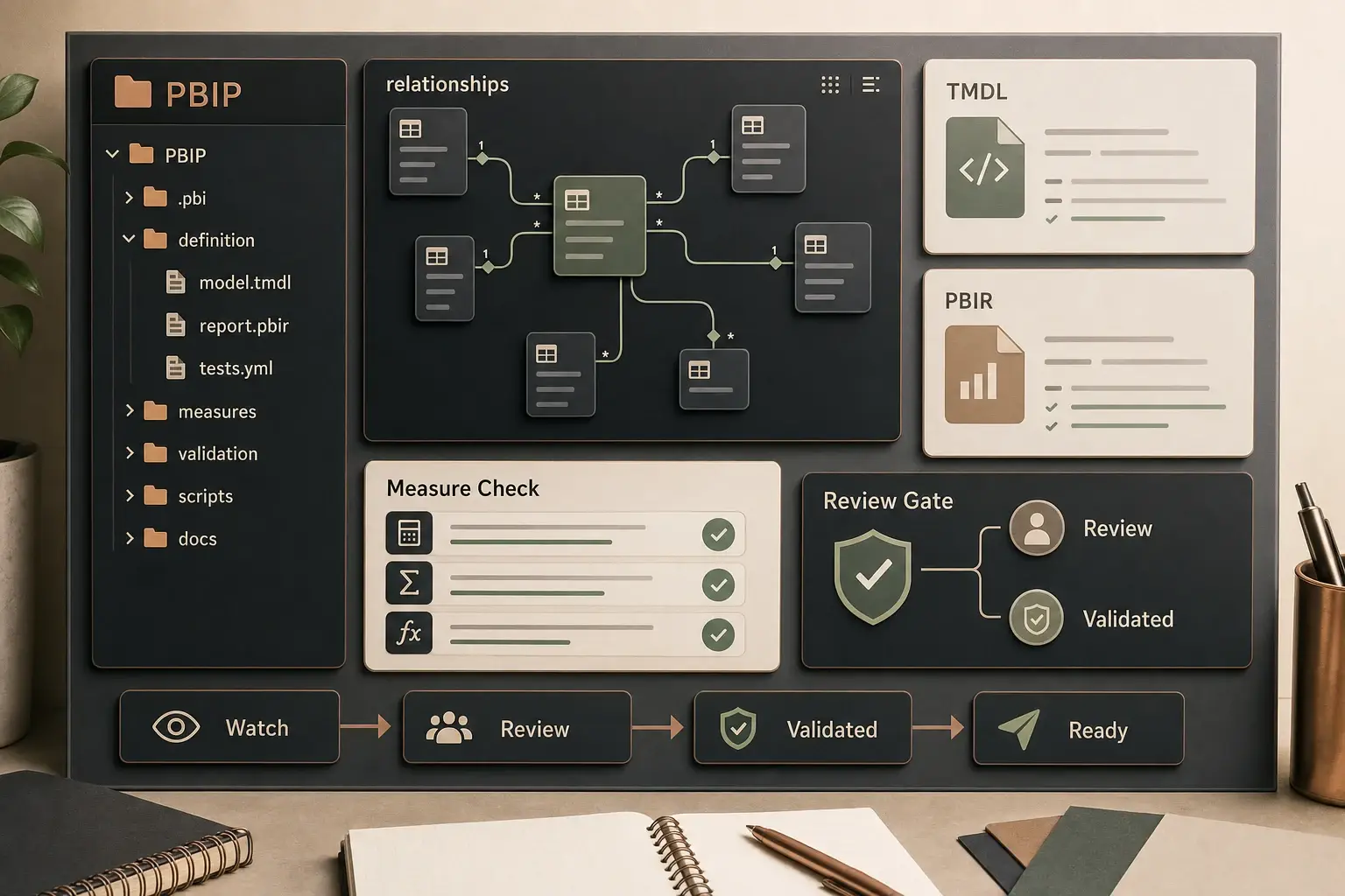
PBIP closes part of that gap. Once a model lives as plain text (TMDL for the semantic layer, PBIR for the report layer), it becomes possible to reason about it programmatically. At that point, automated testing stops being theoretical and starts being a question of: which patterns are worth encoding?
This is the catalog I’d hand a new BI engineer on day one.
What “testing” means in this context
Two things get conflated that shouldn’t.
Numerical validation — does this measure return the right number for a known scenario? — is what most people mean by “testing.” It’s essential, it’s hard to automate fully, and it belongs partly in the review layer. Reasonable pairs of inputs and expected outputs have to come from somewhere, and that somewhere is usually a human who understands the business.
Structural and pattern risk detection — does this measure use a pattern that has historically caused production issues? — is what PBIP enables cheaply. Patterns can be codified. Risky constructs can be detected before they hit a reviewer’s queue.
The pattern catalog below is mostly the second kind. Numerical validation sits on top and still needs a human.
Pattern 1: Active-relationship assumptions
What to flag. Measures that rely on the currently active relationship between two tables, without pinning that assumption explicitly.
Why it matters. Someone will change the active relationship. When they do, the measure’s meaning changes silently — no error, just different numbers.
Rule. If the measure traverses a relationship that has inactive alternatives, it should use USERELATIONSHIP or leave a comment explaining why the active path is intended.
if uses_related_without_userelationship(expression) \
        and alternate_relationships_available(table):
    flag(level="warn",
         message="Active-relationship assumption; pin with USERELATIONSHIP "
                 "or document why the active path is intended.")
Pattern 2: Calculated columns in fact tables
What to flag. New calculated columns added to large fact tables.
Why it matters. Calculated columns are evaluated at refresh time and stored. For large fact tables, they inflate the model size and refresh cost — often quietly. The same logic expressed as a measure costs nothing at refresh and is usually cheaper at query time too.
Rule. Calculated columns on fact tables over a size threshold should carry a justification. “Used in slicers” is a valid reason. “Seemed convenient” is not.
Pattern 3: Implicit conversions in filter arguments
What to flag. Filter arguments that compare different data types without explicit conversion.
Why it matters. DAX will coerce types silently — sometimes in expected ways, sometimes not. FILTER('Table', 'Table'[Amount] = "100") will not return what a reviewer expects.
Rule. Filter-argument comparisons should match types. Flag mismatches at the parser layer before a reviewer sees them.
Pattern 4: IFERROR as hidden control flow
What to flag. IFERROR used to swallow errors silently.
Why it matters. IFERROR wrapping a complex expression returns “nothing went wrong” even when something did. The user sees a number; the team sees no alert; the bug survives deploy.
Rule. IFERROR is acceptable when the error is expected and the fallback is intentional. It is not acceptable as a catch-all. If the expression inside IFERROR is more than a single arithmetic operation, the rule should flag it for review.
Pattern 5: Measures that depend on calculated tables
What to flag. Measures whose evaluation requires a calculated table refreshed at model refresh.
Why it matters. Calculated tables introduce a refresh-time dependency that is invisible at query time. When refresh breaks, the measure breaks — but not in a way that tells the user which part failed.
Rule. Flag the dependency explicitly. The measure’s documentation should name the calculated table it relies on, and the test suite should include a refresh-success check for that table.
Pattern 6: Hard-coded magic numbers
What to flag. Numeric literals in DAX that aren’t obviously boundary values.
Why it matters. 0 and 1 are common and usually fine. 0.23, 1200, or 2024 almost always mean something — a tax rate, a line item count, a fiscal-year cutoff — that will change. When it changes, whoever changes it has to find every measure that used the old value.
Rule. Magic numbers should live in a named measure, a parameter table, or a configuration layer. Inline constants in DAX should raise a flag with the text “extract to a named constant?”
Pattern 7: Circular-risk measure graphs
What to flag. Measures that depend on measures that depend on the first — not strictly circular in DAX (which would error), but graphs where a single change ripples across many measures.
Why it matters. Refactoring becomes risky when you can’t see the dependency graph. Fan-out graphs mean every measure change is a potentially-breaking measure change.
Rule. Build the dependency graph at inspection time. Flag any measure whose subtree exceeds a configurable depth or fan-out threshold. This doesn’t block the change; it alerts the reviewer to the blast radius.
Pattern 8: Bi-directional filter creep
What to flag. New bi-directional filters introduced into the model.
Why it matters. Bi-directional filters are sometimes necessary and often a substitute for fixing the underlying grain mismatch. Each one added makes the model’s behaviour slightly harder to predict.
Rule. New bi-directional filters should be explicitly justified in the change description. Inspection flags them by default; the reviewer accepts the trade-off explicitly, not implicitly.
Where the patterns live
The patterns above run inside a Python inspection layer that reads TMDL and PBIR files directly. Each rule is a small function that takes an expression or a model graph and returns zero or more flags. The inspection runs before the change reaches a reviewer — ideally as part of the same check that runs on every pull request.
The output is not a test report in the traditional sense. It’s closer to a linter: a prioritised list of observations the reviewer should look at, not a pass/fail gate. Some flags block, some warn, some are purely informational. The distinction matters — if everything blocks, developers route around the tool.
What not to automate
A few patterns look automatable but shouldn’t be.
- Business correctness. No static analysis can tell you whether “revenue (YTD)” is the right definition. Numerical validation against known scenarios is the closest substitute, and it still needs a human to curate the scenarios.
- Layout and UX. Whether a dashboard works for its users is an empirical question, not a structural one. Screenshot diffs are not a substitute for user review.
- Performance claims. You can flag patterns that tend to be slow. You cannot automate the decision that a measure is “fast enough.”
The rule of thumb: automate the structural checks where a human adds no signal. Leave the business-semantic checks for the review step, and structure the review step so that’s all the reviewer has to focus on.
The AI-assisted layer
Generative models help with one specific subtask: drafting candidate validation scenarios. Given a measure’s definition and the tables it uses, an AI can propose test scenarios — YoY boundary dates, blank slicers, multi-value filter combinations, measure interactions.
The value is that the AI generates options quickly. The value is not that the AI can decide which ones are the right ones. That decision still belongs to the reviewer. In practice, a useful AI-assisted pipeline produces twenty candidate scenarios; the reviewer accepts six, modifies three, and rejects the rest. The AI never writes to production.
Why teams don’t have this yet
If these patterns are this encode-able, why don’t most Power BI teams run them? Three reasons, in roughly this order:
- The model wasn’t in source control. Until PBIP, TMDL, and PBIR were common, the model was a binary file. Static analysis on a binary is hard.
- Nobody wrote down the patterns. Each team reinvents the same set of “we got burned by this once” rules, implicitly, without sharing them. This catalog is one attempt at writing them down.
- The tooling is early. The Python layer that encodes these rules still takes engineering effort to build. It gets cheaper every year — but it’s not yet a downloadable package.
The trajectory is clear. Power BI teams that invest in this now are building the same kind of guardrail that application teams built a decade ago. It’s not novel engineering; it’s engineering that BI skipped.
Start small
If you’re building this layer for the first time, don’t try to implement all eight patterns at once. Pick one — patterns 1, 4, or 6 usually catch the most real bugs for the least effort — and get it running end to end. Ship it to one reviewer. Iterate on what flags are actually useful vs. noise. Add the next pattern when the first one has stopped finding anything new.
Automated testing in Power BI doesn’t need to be comprehensive. It needs to exist.